LaButxaka
A finance app for people who just want to know where their money goes.
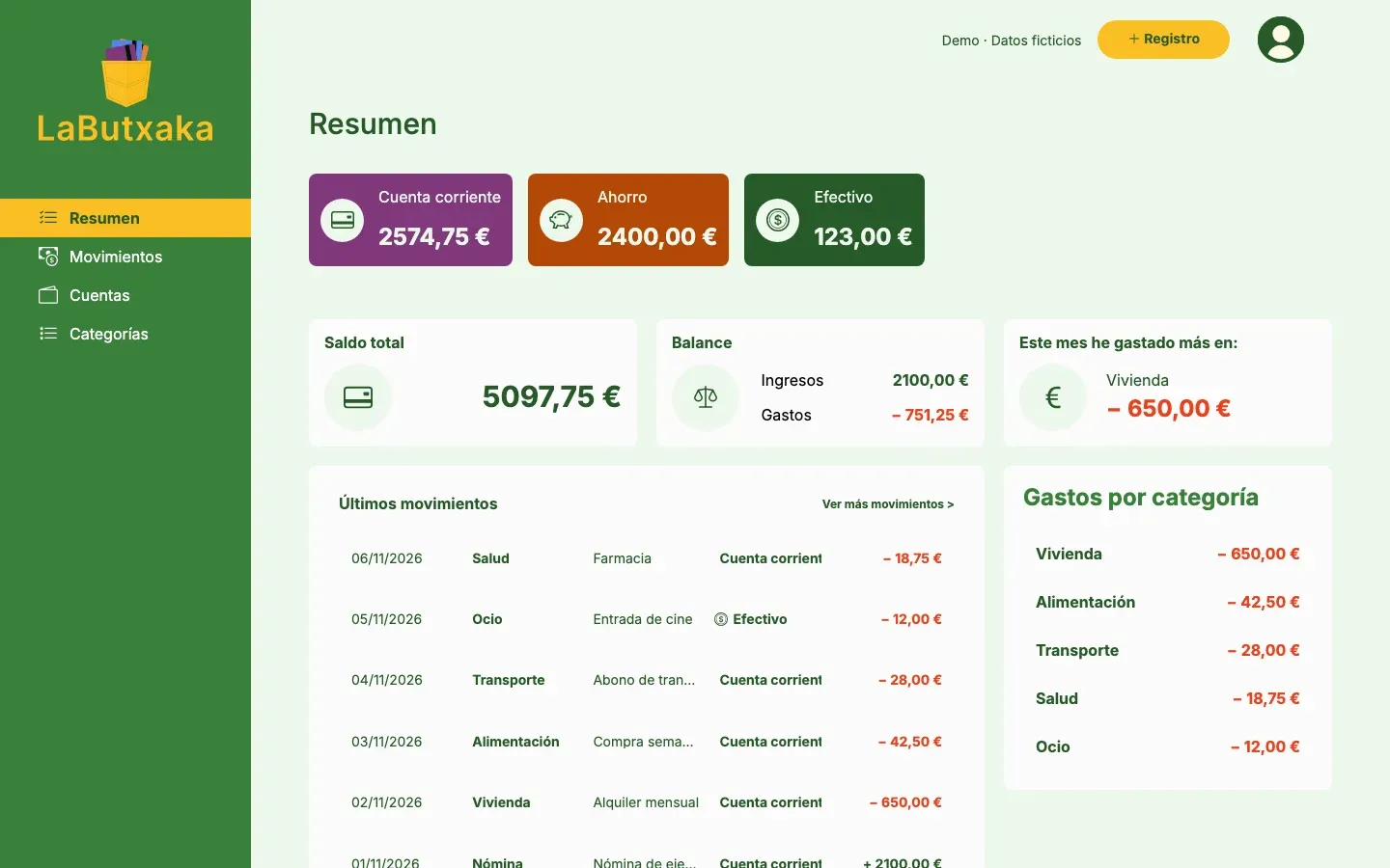
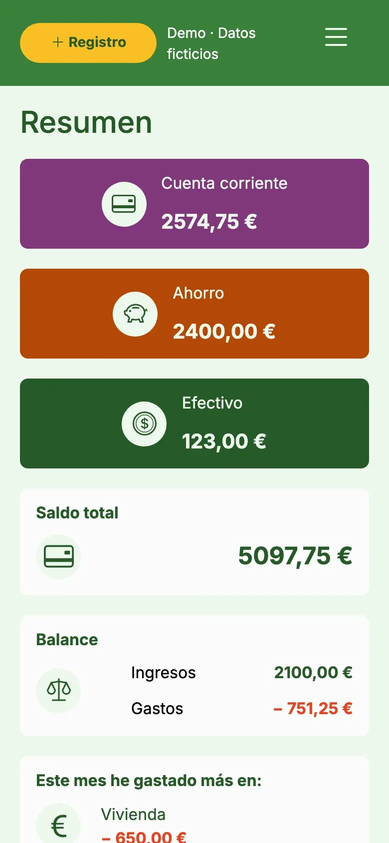
Summary
Butxaca means “pocket” in Catalan. LaButxaka is a web app, born as an academic project at UOC, for managing your personal finances on your own: you add, edit and delete transactions, organize them by accounts and categories, and see a summary of how you’re doing. The interface is in Spanish, so the screen and button names below stay in Spanish.
I designed and developed it myself from start to finish, and it’s the project that best shows how design and code connect: every Figma screen has a controller, a model and a database table behind it.
Finance apps tend to be too complex or to have too many features for people who just want to know where their money goes. I focused the app on the essentials (transactions, accounts, categories, summary) and kept it clear on desktop and on mobile. Today it’s a working app I use at home, with a public demo, a video and an interactive tutorial.
Approach
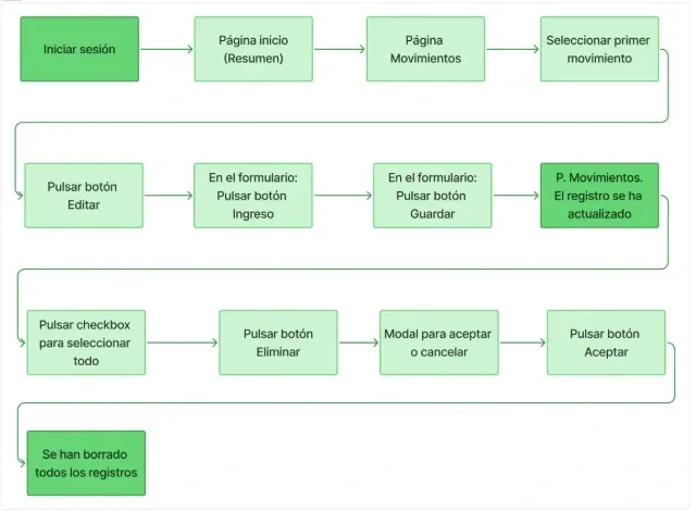
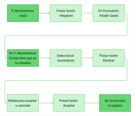
Before opening Figma I did a benchmark of other finance apps to see which interface and interaction patterns worked and which were unnecessary. From there I put together a concept map, a phased plan and user flows for the three key actions: creating, editing and deleting a transaction.
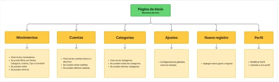
Drawing those flows at the start saved me a lot later: each box in the diagram ended up as a route or a controller method.
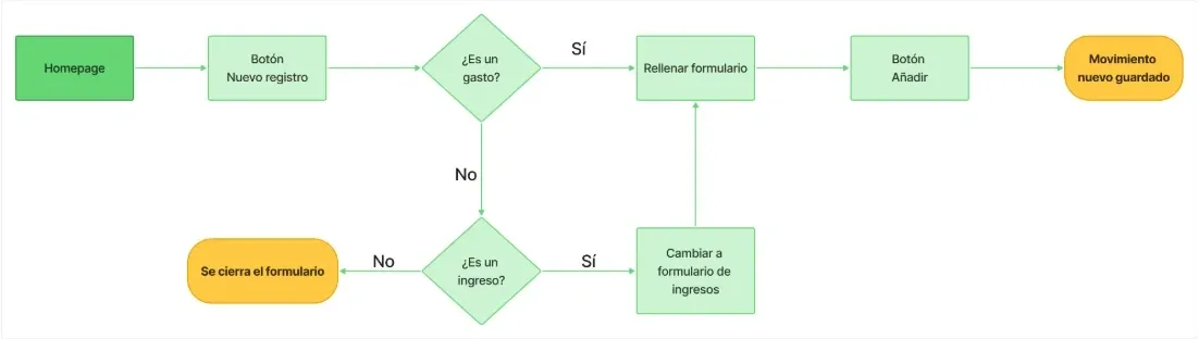
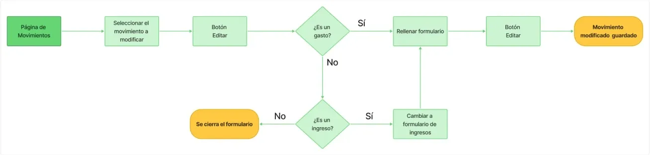
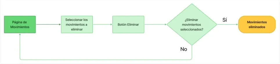
This is how those boxes ended up in MovimientosController:
| In the flow | In the code |
|---|---|
| Nuevo registro (new entry) button | create() |
| Añadir (add) button | save() |
| Editar (edit) button, with the transaction selected | edit() |
| Editar (edit) button, in the form | update() |
| Confirm the deletion | delete() |
Design
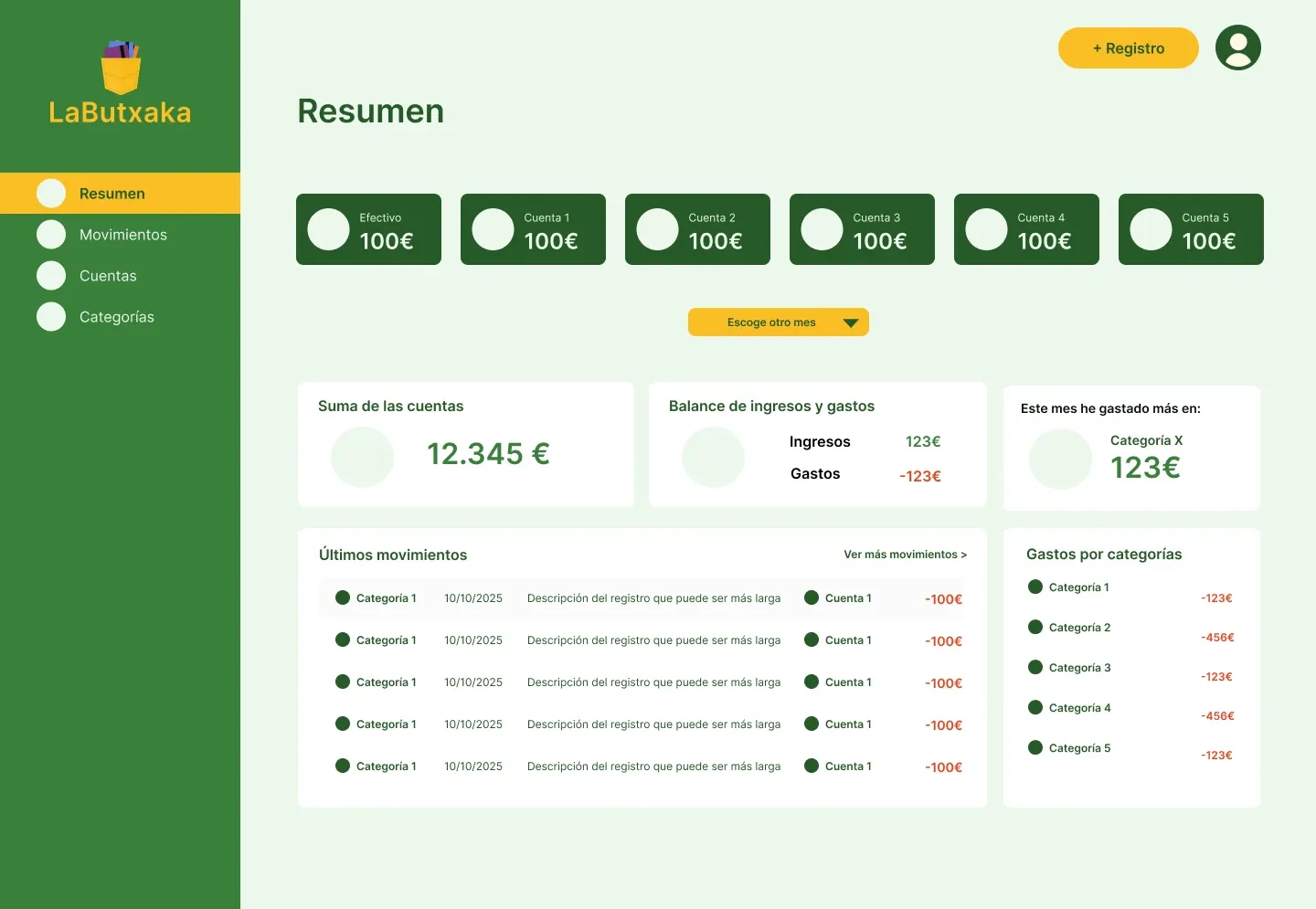
I created a user persona and a moodboard to be clear about who I was designing for and what atmosphere I wanted to convey. With that I defined the style guide (typography, palette and logo).
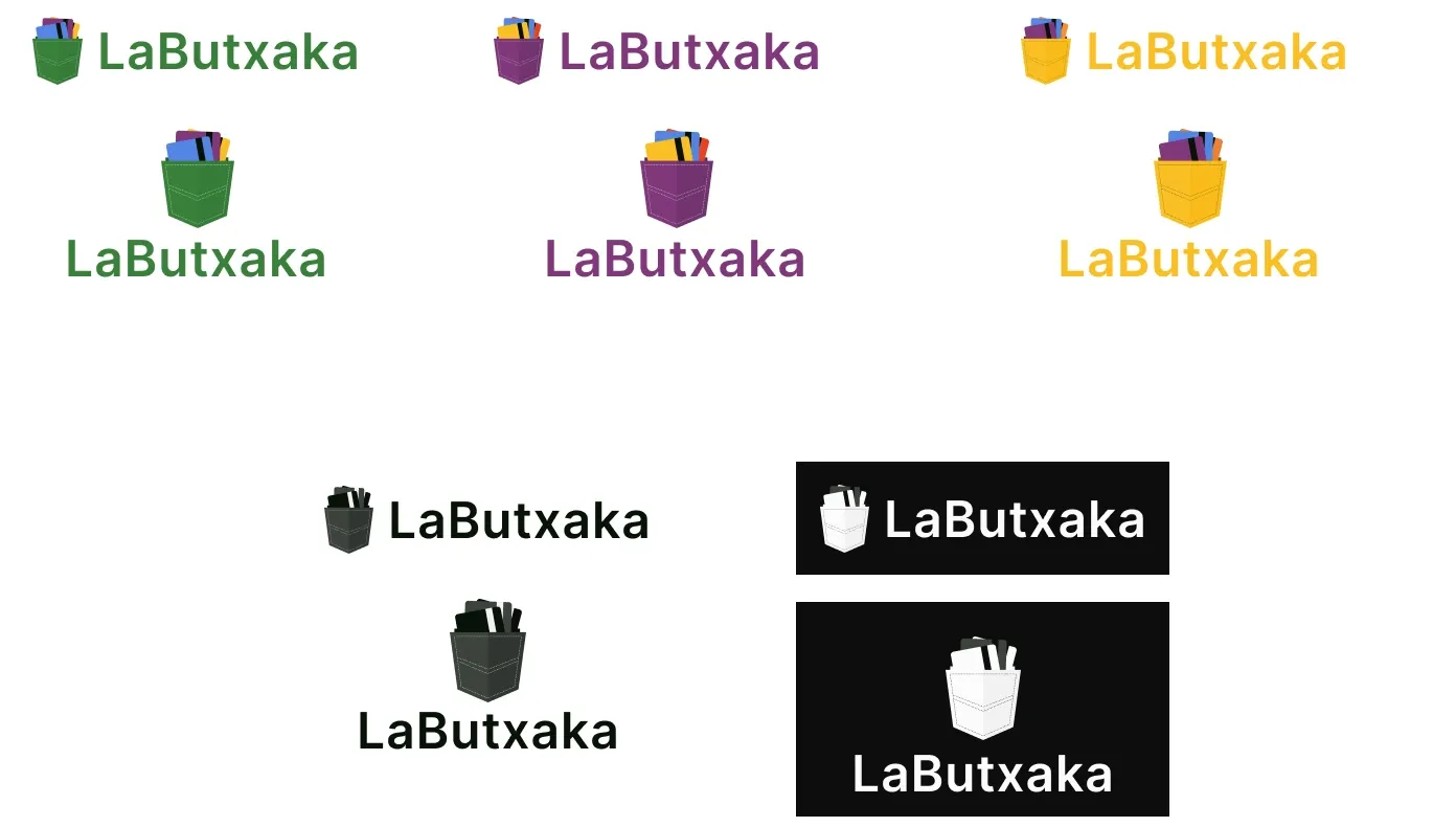
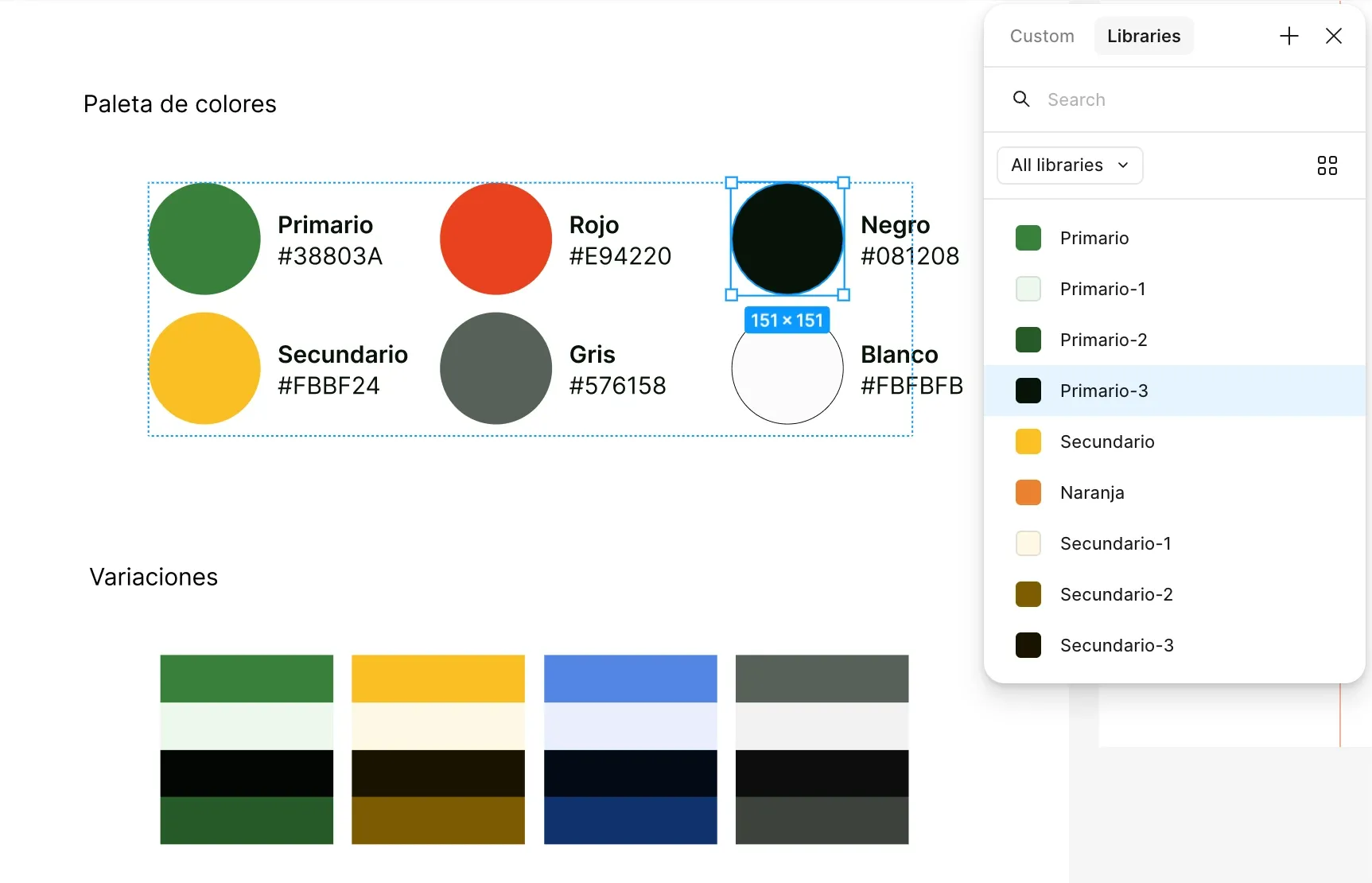
Then, in this order:
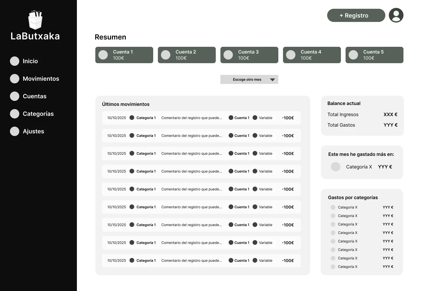
- Low-fidelity wireframes to validate structure and flows without getting distracted by styling.
- High-fidelity prototype in Figma, with the style guide applied and the flows prototyped.
Development
Stack: PHP and SQL on the backend, HTML, CSS and vanilla JavaScript on the frontend, and Shoelace components (web components) customized to fit the style guide instead of looking like a generic library.
MVC architecture. I chose it with the future in mind: adding forms to manage accounts and categories, filters or sorting should mean adding pieces, not rewriting. Separating model, view and controller also forced me to think of the design as a set of reusable components.
The process, in order:
- Schema for the relational database (transactions, categories, accounts and users).
- MVC for transactions, the heart of the app.
- Controllers and models for the other sections.
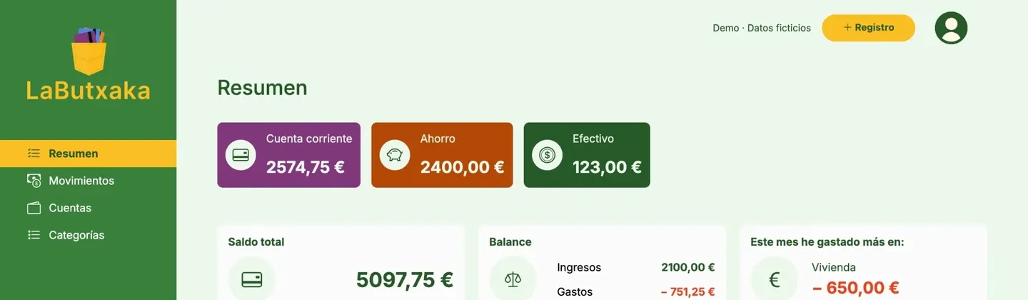
- Desktop layout: the Movimientos and Resumen pages.
- Mobile layout and responsive adaptation for tablet.
- Testing: tests during development and a smoke test in production.
I adjusted Shoelace’s variables and parts until the components matched the palette and typography from Figma.
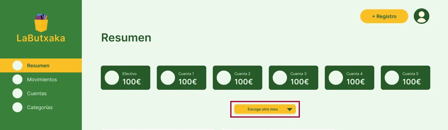
What got left out. In the design, Resumen also had a button to filter by date. I ran out of time to apply the changes, so I left it as a pending task in the backlog.
How I presented it to the user
For someone to use the app, they have to understand how it works. I chose two complementary formats:
- A video, friendly and visual, that shows what the app does without getting technical.
- An interactive tutorial the user can come back to whenever they have questions while using it.
The video introduces the app; the tutorial answers questions once the user is already using it.
What I learned
- User flows are technical documentation. Done well, they’re halfway to the architecture.
- A component library isn’t enough as a design system. Shoelace gave me the accessible, functional base, but I brought the identity by adapting it to my tokens.
- Thinking about scalability changes how you design. Knowing there would be more forms in the future made me design patterns, not isolated screens.
- Next steps: managing accounts and categories from the interface itself, a date filter in Resumen, and filters and sorting for transactions.